
Improving visual experience for Mental Health Counselling SaaS Platform - ACFB - (A NZ Health care startup)
Company: A Change For Better, NZ | Role: UX/UI Designer | Timeline: April - November 2022 | Tools: Adobe XD, Asana
Achievement: Received great feedback from the team on the visual design without missing their brand. Delivered pixel-perfect high fidelity wire frames for 80+ pages including e-commerce pages using Adobe XD
The Work: I was the sole UX/UI Designer and collaborated closely with CTO and CEO at ACFB, NZ to create high - fidelity wireframes using Adobe XD that improve and maintain the user experience consistency and follow the brand guidelines.
CEO's Endorsement: "Rameez has been helping A Change For Better for almost a year now. Her design style aligns well with our brand and she herself is a pleasure to work with. Rameez is always going over and above to ensure her clients are happy and we are!" - Ashley Cairns
The Process
The process for redesigning the ACFB platform started with getting requirements from the client (CEO and CTO) and discussing a style of application. The same contents from the existing application were used. I work on redesigning the whole application's B2B and B2C screens, dashboards, forms with good visual experience. We also created some new pages and features (such as adding new services or products to the store, a page for clinic room rentals to practice) as an extension of the application. I collaborated with our wonderful, small, remote team (based in Christchurch, NZ) and started creating the style that maintains the user experience throughout the product.
The style guide is created with the clear details of all elements and its different interactive stats. The reusable components (design system) are also created to maintain consistency and ease the development process. The typography, menu, CTA buttons, form elements, dashboards, tabs are created with a pixel clear detail in the style guide and the hi-fidelity wireframes are created in Adobe XD with clear interaction details (prototyping).
From the UX perspective, my main goals were to improve the efficiency and the visual experience of the product. To improve efficiency, I try to achieve that by adding extra details to the interactive elements, grouping and isolating elements where they are needed. To improve the visual experience, I am changing layouts, maintaining the same consistency and following the same style throughout the product. I shared a few components of my work,
Style Guides
The site has multiple reusable components. The style guide is created to explain the typography (color, size, alignment, line height, letter spacing, font weight), CTA Button stats (default and hover), reusable components design (spacing and behaviors). Here are some of the style guide pages.


Hi Fidelity Wireframes


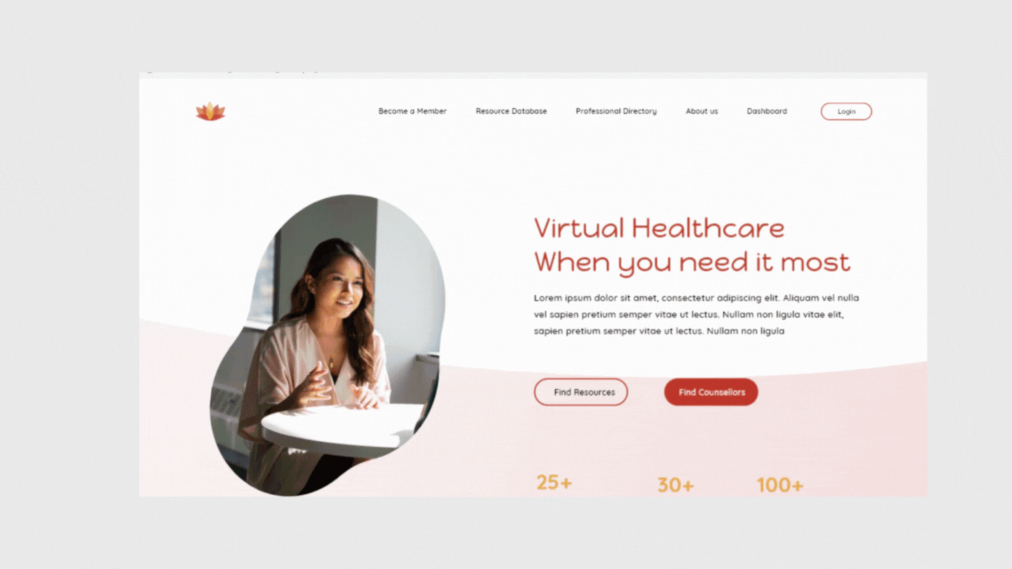
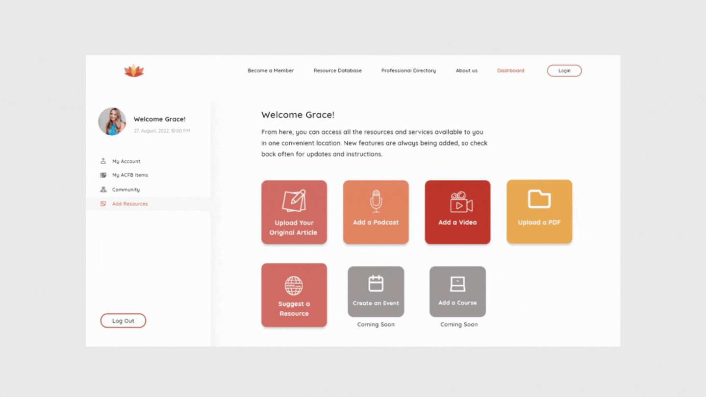
A screen shot from Adobe XD file. A part of deliverables for ACFB
Interaction Design
How the product interacts with the user is clearly defined. The interaction elements such as text (Visual Hierarchy - font size and color) , CTA buttons, spacing, feedback and the supported information to understand while completing the tasks (Forms) are defined and try to give them to help improve the efficiency of the product.
The wireframes were created for every behavioral interaction with the application. For example, the image below shows the interactions screens for each and every tab and CTA button interaction. I also give a proper style guide for different stats and also give some developer notes if it is needed. And the prototypes are also made to explain the product interaction.

How do I make the text interact with people? I carefully arrange all the information by giving a proper visual hierarchy, grouping it (used mostly on forms), isolating if it needs more attention, giving perfect pixels for the user to understand without taking much time (improving efficiency). The style guide and developer notes are given for the developer to understand how the product interacts.

Prototyping
The sample product was made by connecting all the interaction. The following are the prototype for the home page that includes hover interactions and also a prototype of subscriber dashboards.
My Experience
As working on a SaaS product and being a solo designer for the team, I got more opportunity to work on different kinds of screens, dashboards and forms, which extended my quest for learning and understanding different design concepts.
Working at ACFB also helped me to get more working experience on Adobe XD design tool and also explore a project management tool "Asana" to collaborate with the remote team. The ACFB team supported and continues its support throughout the process and each and every day with new challenges.