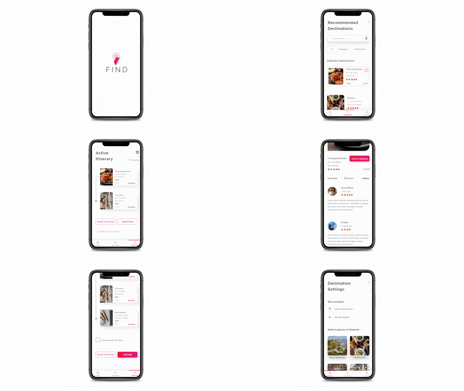
Designing city guide and travel planner app - Find - UX Case Study and UI Design
Role: UI/UX Designer | Personal Project | July 2021 - September 2021
The Challenge: A city guide is a publication that points out various destinations, venues and services within a particular city. The main purpose of a city guide is to provide useful and up-to-date information to its residents and tourists. My idea is to create a digital version to enhance its usability. The FIND app helps the user to know about the places around their/ any location and prepare their itineraries.
Discover
Research
My first step in this phase was downloading some travel apps and observing how it works., I started my research with a few questions - what are city guides? What are their main purposes?
I discussed with my kith & kin, read articles and googled the issues on travel apps and planning. I framed the questions for the user interviews and conduct user interviews in casual conversations. I keenly observed their answers and it was very helpful throughout my journey.
Here are some of my questions,

I step into the next stage of the design thinking process where I can think from the user's mind. After my research on who, why and when people use the city guides, I can group the users into three major categories.
• Tourists
• New residents
• Existing residents
I want the app to cater to everyone. I always believe that more accessible design always produces better usability. I decided to design one of my personas with some specific needs that would help me to design the product in a better way.
Empathy Map : In user interviews, my first question was “ Do you ever use city guides?” Most of the respondents said “no” and the few who answered “yes” said that they use it only when visiting new places.
The major questions help me to point out “Why they don’t use it in their residing cities? From my research notes, I started the “Multiple user Empathy mapping” which helped me to understand the user's behaviors and feelings. I started creating Empathy Mapping for every major user group.


Define
My second stage of design thinking consists of 4 steps that help me to define the user's needs/goals, pains and how I can help them to achieve their goals. The methods I used are,
-
Personas
-
Story Boarding
-
User Journey Mapping
The assets are designed and created using Figma
Persona 1 :

Persona 2 :

Story Boarding :

User Journey Mapping :

Ideate
Asking so many “HMW” questions challenged me to reframe the problems and find solutions for them. I started framing what are the things the app must provide the users. I organized the ideas for the app.
• Gives categories of interest
• Location can be set to current/new
• Design Sign In / Register to allow the user to persist their interests and itineraries in the app.
• Push notification for closing and opening time saves the user from missing the plan
• Options for transport for Tourists / Traveler
• Voice search /Keyword search
• Simple layout for easy understanding
• Sorting option in the itinerary
• Easy navigation from any page
• User reviews and suggestions on search results
• Good color contrast
• Save itinerary for future use
Information Architecture :

Hi Fidelity Wireframes and Prototyping :

.png)
.png)
Usability Testing
After completing the design phase, I test the app with two representative users who fall into tourist and new resident categories.
Tasks for a tourist :
• Sign Up for the App
• Explore the places without location settings but only by their places of interest
• Select two places of interest and two destinations
• Save the itinerary
• Create 2 plans
Tasks for a new resident :
• Sign Up for the App
• Explore the places nearest to their desired location
• Select two places of interest and three destinations
• Save the itinerary
• Create 2 plans
Feedback :
• The users found it easy to use and were happy about the product.
• One of them gave me some feedback about the alarm settings whether will it alarm for opening or closing time. If they are going to use the itinerary the next day how it will work.
I try to fix it by getting additional information from the user and asking about the alarm settings while they activate the itinerary and giving them a deactivation option to cancel the itinerary process.
Implementation - New Screens :


Sample Product

Learnings
• As a self taught, solo designer it was a great exercise to understand and practice the core concept of UX design to develop the whole product.
• Understanding from research phase to testing phase
• Learning different empathy methods to understand the user's situation and problem
Thank you for scrolling!
