
Improving brand & responsive web experience - Language Elevator (An Auckland Small Business)
Client: Language Elevator, Auckland | Role: Web Designer | Timeline: July - October 2022 | Tools: WIX Website Builder
Achievement: Received great feedback from the business owner on the design rationales and efficient work. The website’s site session (34%), unique visitors (24%) and average session duration (7%) increased after the redesign.
The Work: Language Elevator is a Private English Tutoring Institute located in Auckland. I was given the opportunity to redesign its brand and responsive website that maintains good user experience.
Business Owner's Endorsement: "Rameez has recently redesigned and upgraded the website of my company, Language Elevator. The structure and feel of the website is very professional and pleasing to navigate around. It was a pleasure working with Rameez, as she made plenty of constructive design and layout recommendations, while clearly explaining the reasons behind her recommendations. The work was also completed quickly and efficiently, through a combination of zoom meetings, face to face meetings, and electronic correspondence, so the upgraded website was completed and published ahead of my expectation. Overall, I'm really very happy with the website design and highly recommend Rameez to anyone wishing to create a website or upgrade/ redesign an existing site." - Brett Somerville
Discover
The Project Planning
The project planning started with the client interview to understand their objectives, expectations, previous students' experiences with the website, business goals and the brand voice they want to show to their customers. I also worked to understand the industry.
The project goals are set to : create a brand and redesign the website that maintains the customer experience consistency and responsiveness. The business goals are set to improve the number of enquiries for the free class.
Define
Analyse through various experience pillers
I thought about analyzing and ideating under the personal, convenient and empowering customer experience pillars.
The product’s features need to fulfill these user needs.
Personal : Contains all the relevant information that is easy to achieve that helps the clients' objectives
Convenient : Clear response through mobile and desktop
Empowering : Clearly organizing the information architecture for the user to find the information quickly.

Ideate
Designing Information Architecture
Language Elevator website has 11 pages. All the pages and most of the sections have a link to the Free Course Light Box. I decided to use the light box instead of a page because the user can resume the browsing after they complete the form. I thought about reducing the time for looking and thinking about where they were before getting into the form.

On Desktop, all the sub pages have a connection with the other sub pages and the main course page. On mobile phones , by thinking about minimizing the page size, we removed that link option.
The following IA shows all the sections to be displayed on each page and their orders. We use the same order in all the subpages for the user to guess easily about where the information is.

Branding
Colour Pallete and Typography


Color Contrast following WCAG 2 - Accessibility Standards

Custom Designed Components
I designed and created a few reusable interactive custom components in WIX. They are used all over the site to maintain a consistency of user experience.
Creating Style
Created a hover interaction for repeaters. Double colour headings were used. The adjectives in the heading were given with more visual hierarchy.(bright colour). The imagery follows the same tone. Important sections were given in the same accent colour. The consistency is followed in all pages.
Each element I placed on the page for a reason. Here I explained a page,

Development
Every section is divided into columns. The process is like creating strips -> Dividing Columns -> Placing the Elements. Which results in a good view in different viewports. I carefully use the white spaces and grouping for improving readability.

Experience Testing
We conducted experience testing with our customers to ensure the website works well in the following criteria,
* How website navigation works?
* Can the user find all the relevant information regarding the course, institute and the teacher?
* Functional experience
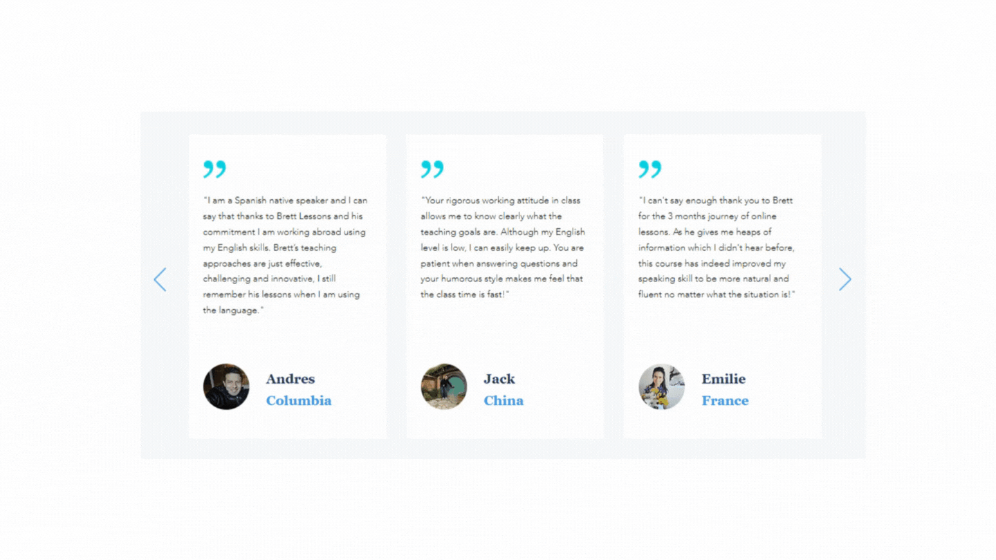
We involved 3 of the users. It is an unmoderated, remote, explorative testing. The users were allowed to explore the site, use forms and give their suggestions from their experience. Below are some of the feedback.

Implementations
We improved the following things after the testing.
Home in Menu : One of the testers found it hard to find the home as it is given as a link with the logo. Even though we placed them there to minimize the menu items, we thought about usability and decided to keep them on the menu and we also added breadcrumbs for secondary pages and subpages for the user to find the pages easily.

* Feedback after the form submission : We gave the feedback just a message from the form before. But when we get to know, some users find confusion about whether the form is submitted or not and also fail to note the message under the form. So we created another lightbox that shows the customized thank you message for submitting each form.
* Added Video of the Tutor : One of our testers suggested that adding a video would be great to find out about the tutor's accent. From a business perspective, we added the video to the Tutors introduction section.

* We also changed the format of some of the contents to make it easier for reading. Added WIX tables and DB to reduce the number of lines in Terms and condition page.

The Live Website :
Results & My Experience
The website’s site session (34%), unique visitors (24%) and average session duration (7%) increased after the redesign. Source: WIX Traffic overview- Comparing with year2020
It was a great experience to work on a product that is inclusive of all cultures (Users: expats and expat students from all over the world) and all technology-level people that motivated me to learn and carefully craft a design that fits and is usable for everyone.
I also got the opportunity to work on branding, which extended my exploration of colour theory and typography. During the usability testing, I got the opportunity to understand different perspectives of people from different countries.